This is the fourth in a series of posts documenting the creation of Theme Friendly.
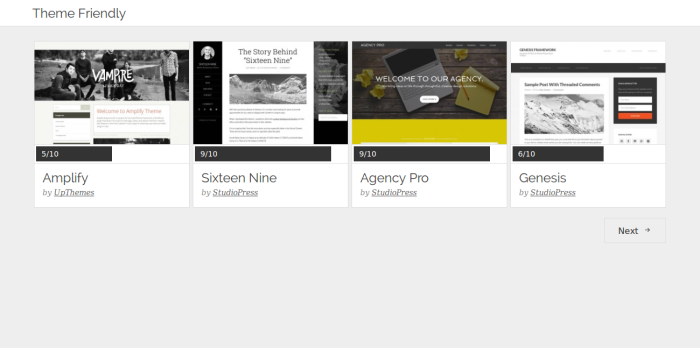
On day three, I built the review archives page. I don’t think this page will be used directly, but on day four I incorporated it into the search results page, so it was still worth building.
Day 3 Screenshot
After all the hard work that went into building the single review page on day 2, this page was pretty short and sweet. It only had to display each theme’s title, quality score, thumbnail, and author. Most of the backend code was easily modified from the single review page code. I just had to add a new image size and some CSS to handle the new layout.
In the next post in this series, I’ll be detailing how I built the search functionality that makes it simple to find only themes that match your exact requirements. Sign up for the Theme Friendly newsletter to find out when it is published. Until then, Happy New Year!

I came across your site via Twitter and decided to check this out. I have to say you have an interesting concept and I believe a lot of people will use it…especially when many often look for something specific.
Thanks Andre!